MYLAPS · 2024–2025
Control under
pressure
Race Control Manager grew out of a tool for testing hardware. I redesigned its Windows interface around what officials need during a live session: the track, the competitors and the controls to send a flag.
Freelance UX/UI designer · September 2024–February 2025
From test tool to workplace
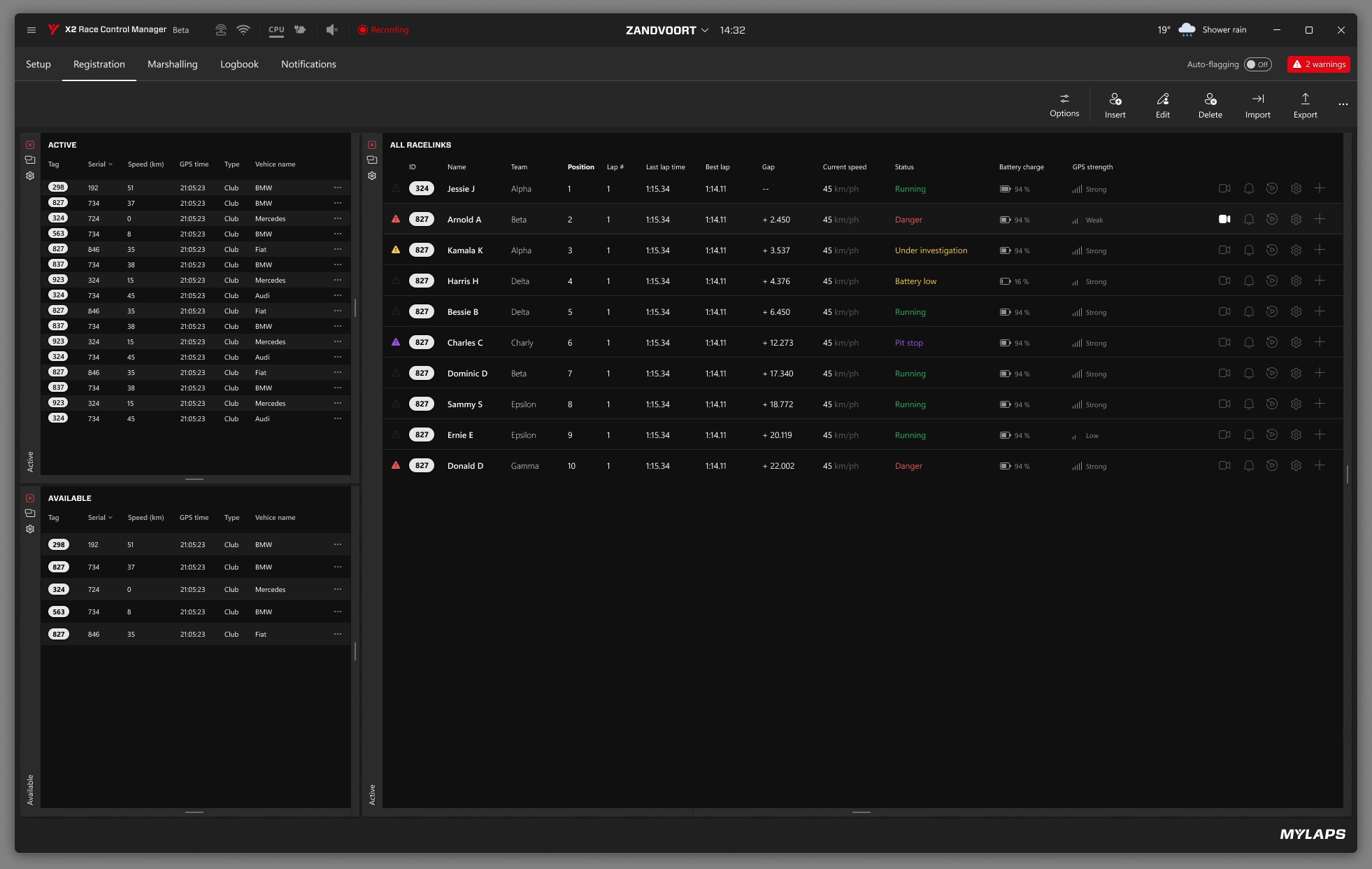
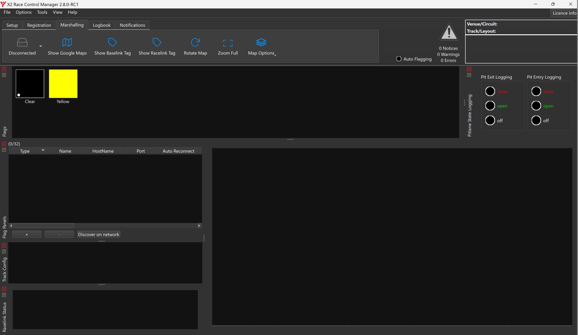
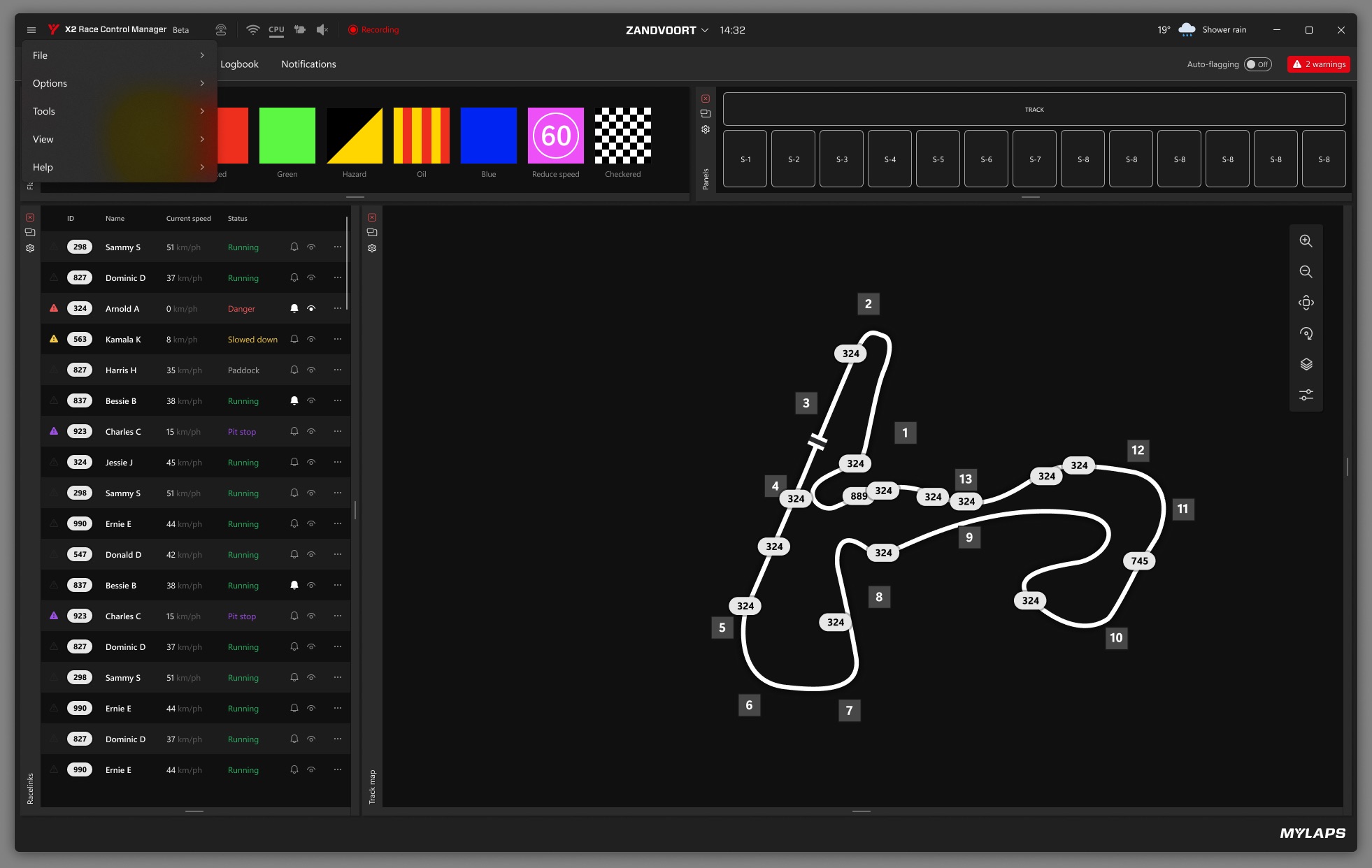
RCM started as a way to check whether a RaceLink could be followed on track and whether devices reacted to a flag. Once it was used to run races, an official had to read the situation and act straight away. I reworked the navigation, the action bar and the layout of the screen.
RCM Core Nav Review · Figma · Race Control Manager for Windows
Tools where the work happens
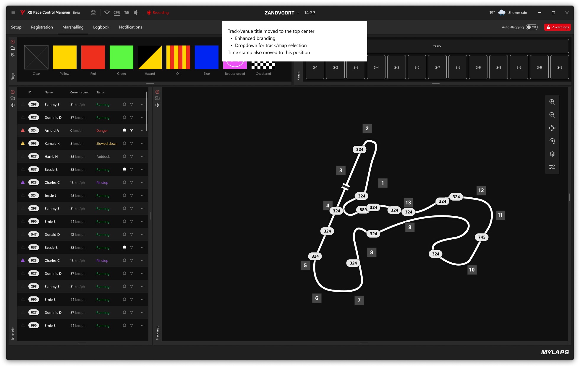
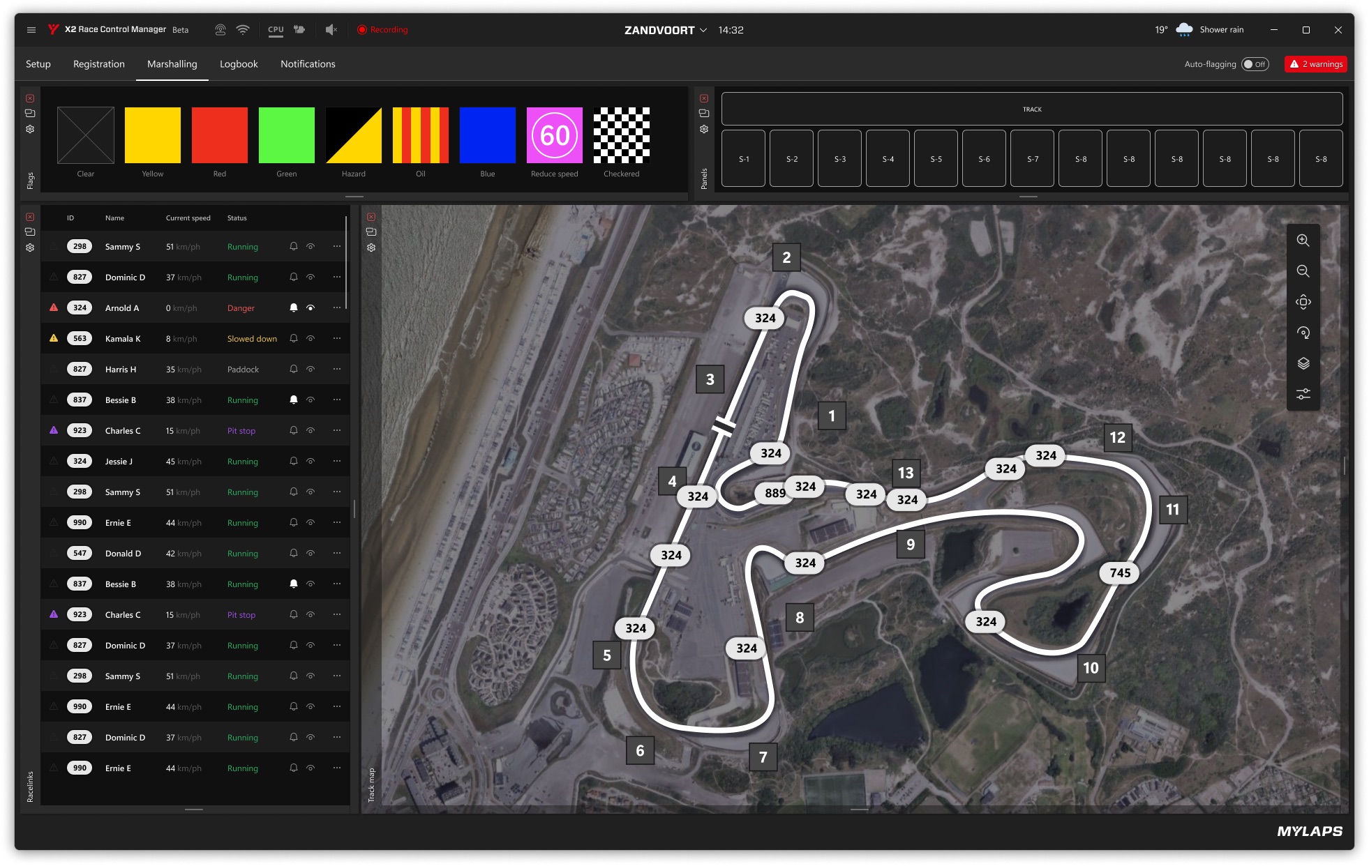
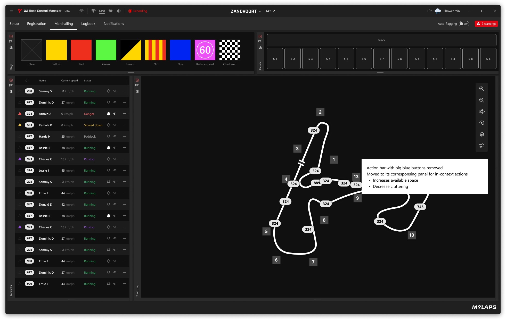
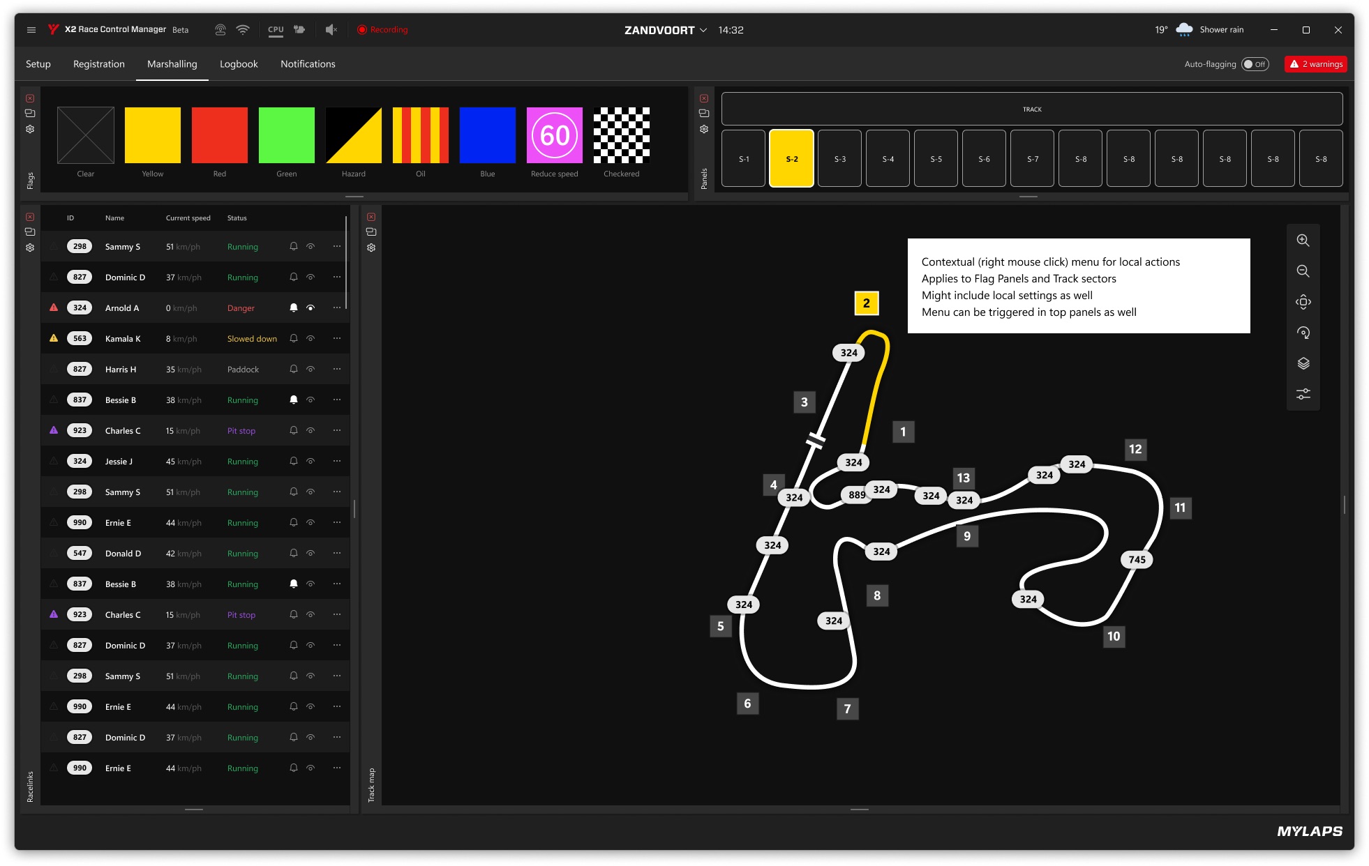
The old screen stacked a menu bar, a toolbar with labelled buttons and a row of big blue action buttons above the work. I removed that layer. Map tools like zoom and rotate moved onto the map itself, and the actions moved into the panel they act on, or into a right-click menu on a flag panel or track sector. That freed space for the track and the competitor list, and an official no longer has to look away from what they are acting on.
Status at a glance
A race official scans, they don’t read. I moved the title bar to black with white text and kept red for what needs attention: recording, warnings, competitors in danger. Connection, CPU and audio became small icons instead of words like “Disconnected”. Track name and time sit in the centre of the title bar, the weather is a compact icon, and auto-flagging got its own switch next to the warning count. The tabs stayed, with a clear underline, because officials already knew them.