Salonized · 2018
Not a beauty
brand
When I joined Salonized in 2018, my first job was its brand. I designed the logo, the colours, the type and the visual language, and art-directed the illustration that carries it, in under two months.
Designer and art director · logo and brand identity · 2018
Between beauty and tech
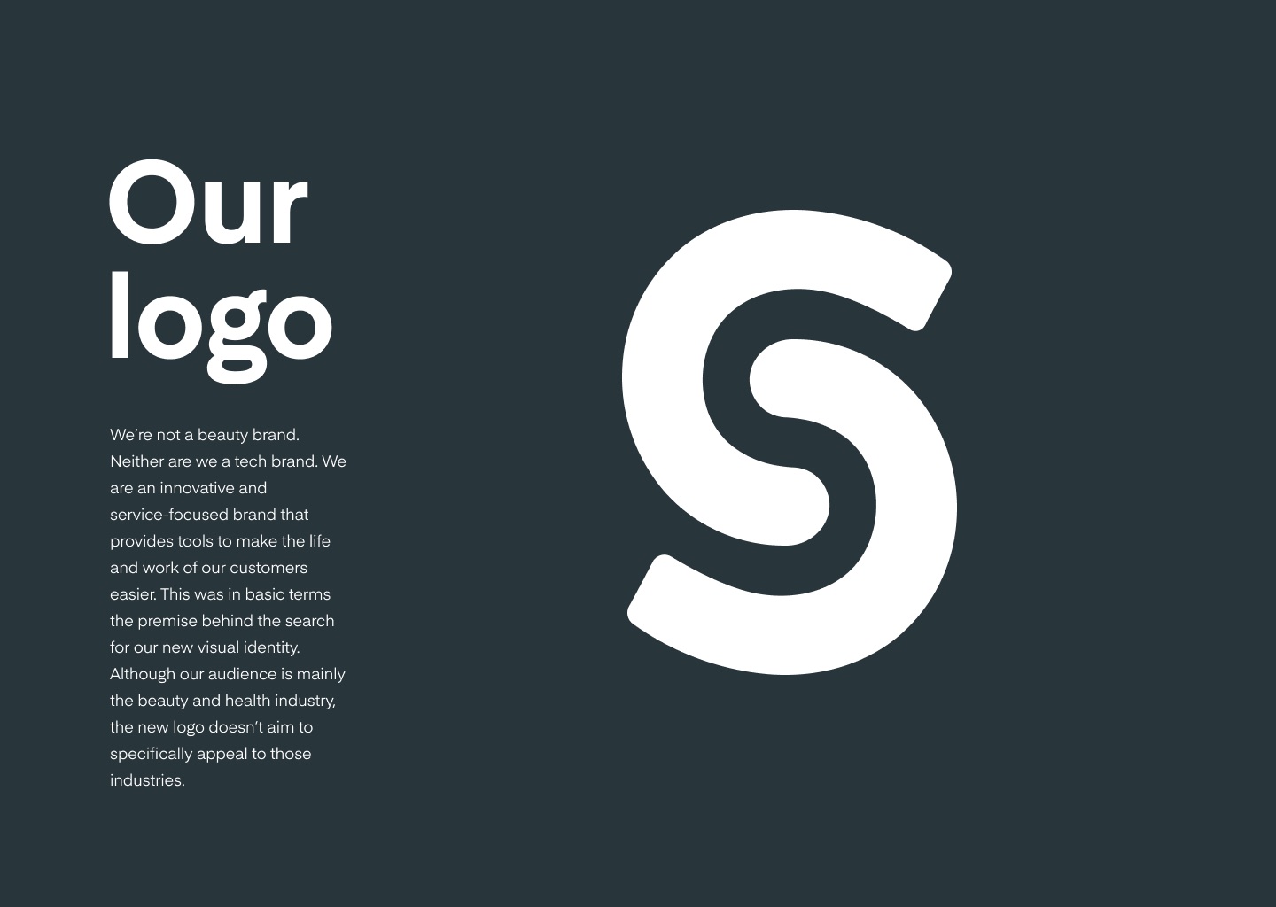
Salonized sells software to salons and spas, so the obvious routes were a beauty brand or a tech brand. I chose neither. The premise I wrote down: a service-focused brand that makes the life and work of its customers easier. The logo had to feel at home in a salon without looking like one.
An S hidden in two Cs
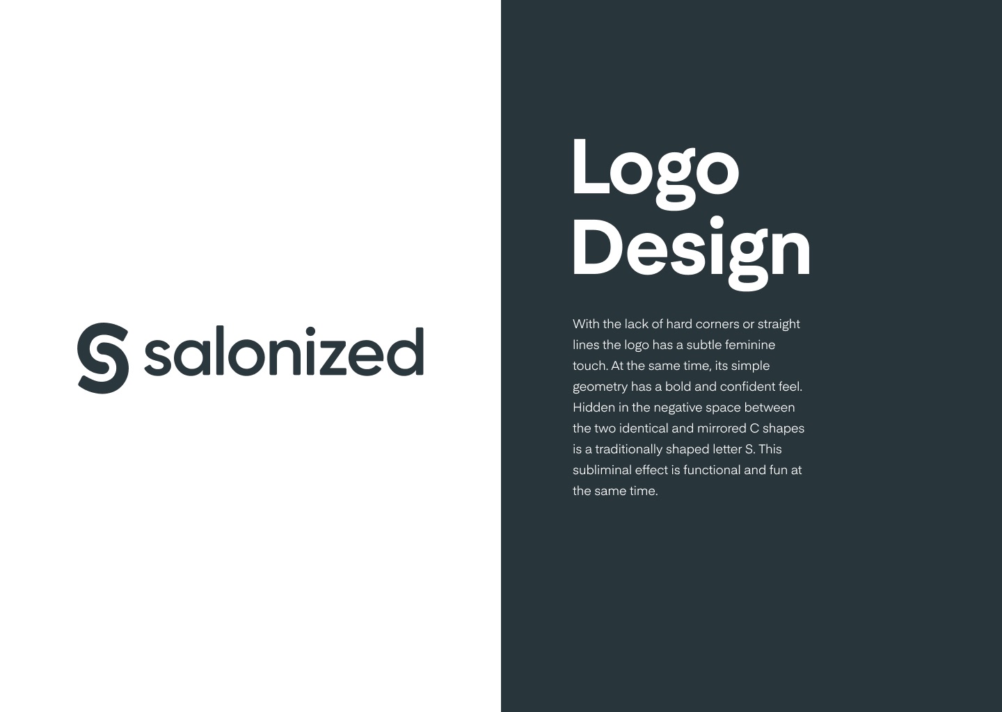
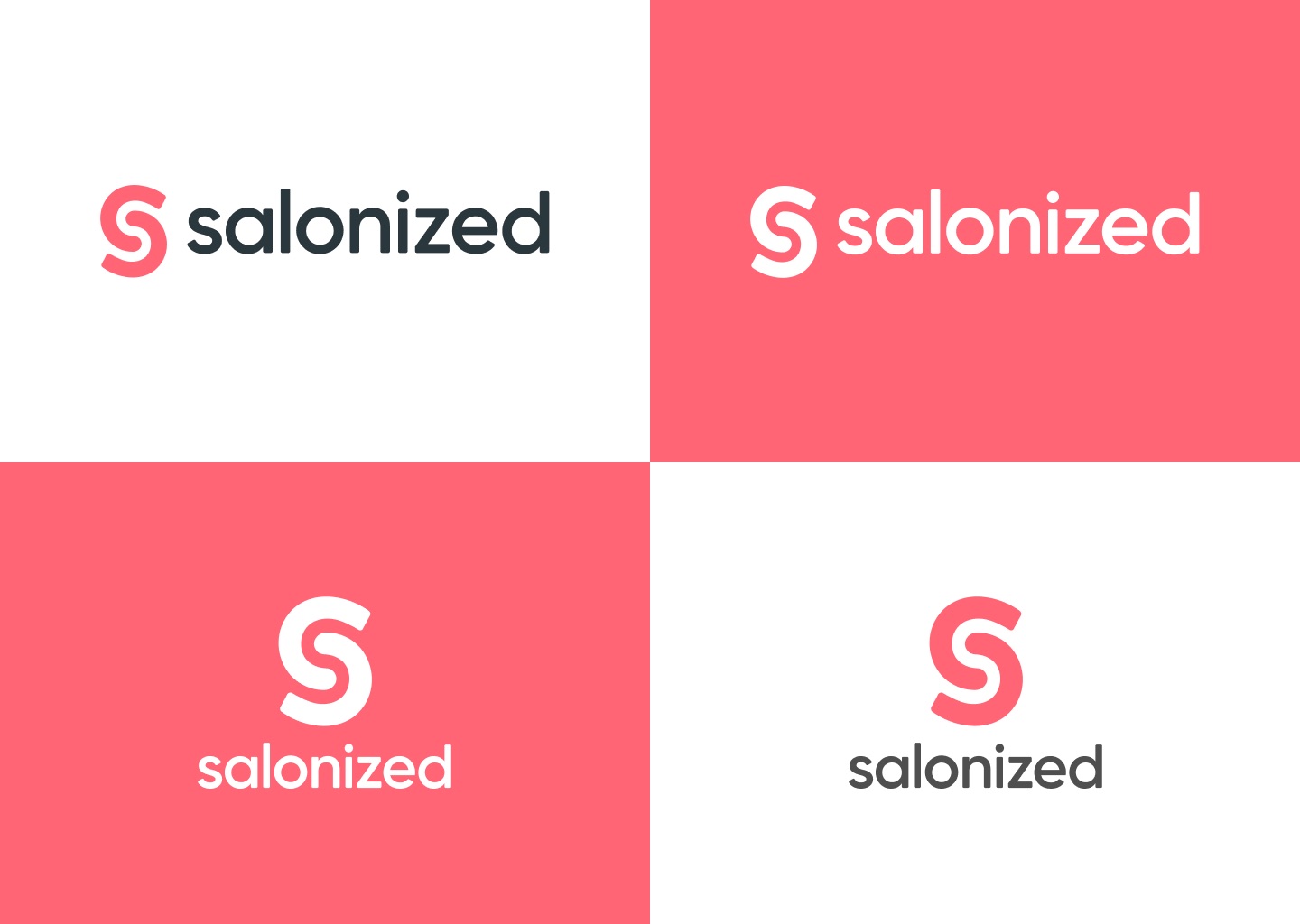
I sketched and tested many concepts, on screen and on paper, before landing on a glyph with no hard corners or straight lines. That gives it a soft touch, while the simple geometry keeps it confident. The shape is two identical, mirrored C forms; the S appears in the space between them. I paired it with a custom-drawn wordmark and checked every lockup in pink, white and slate.
One pink, and a colour per product
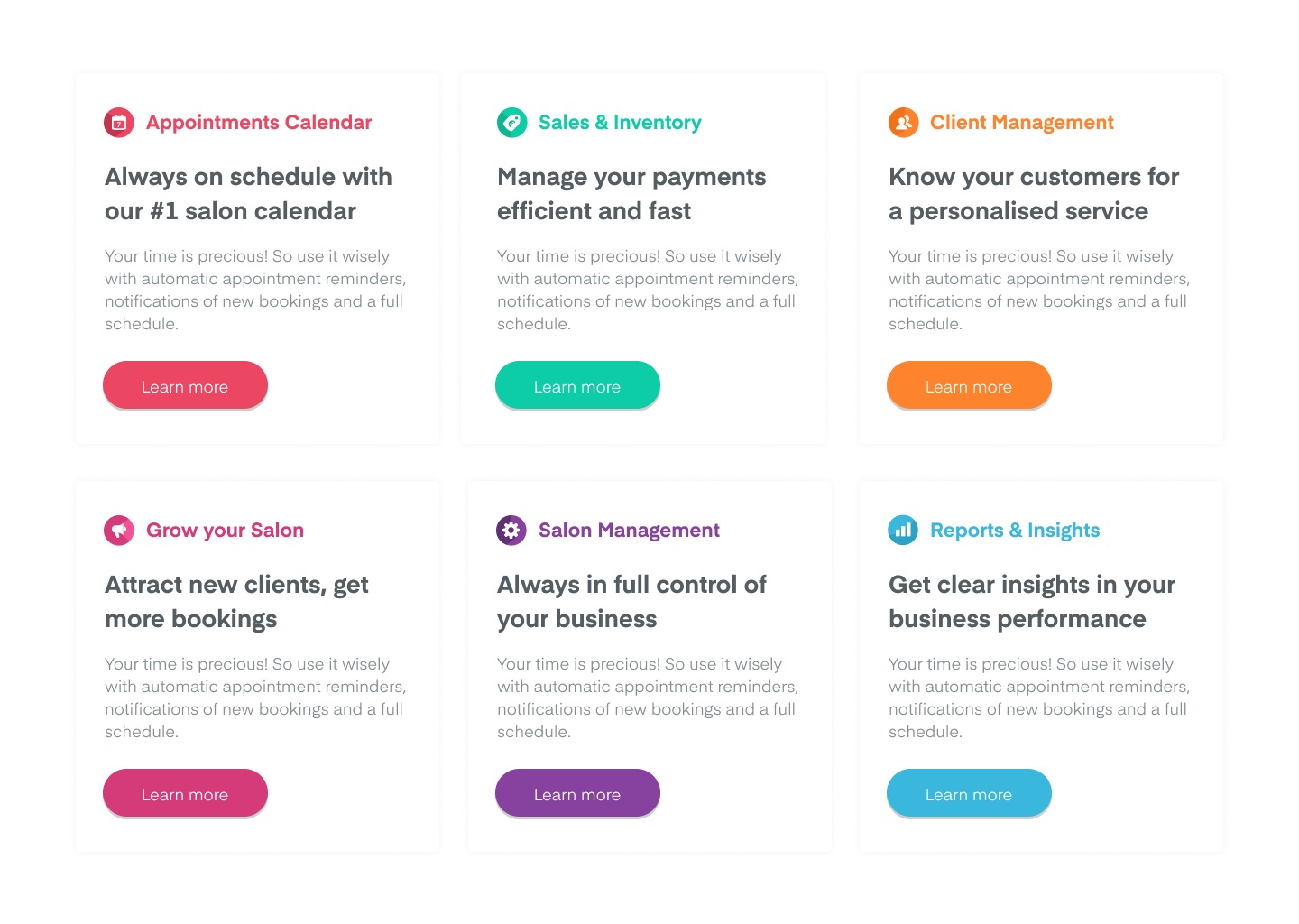
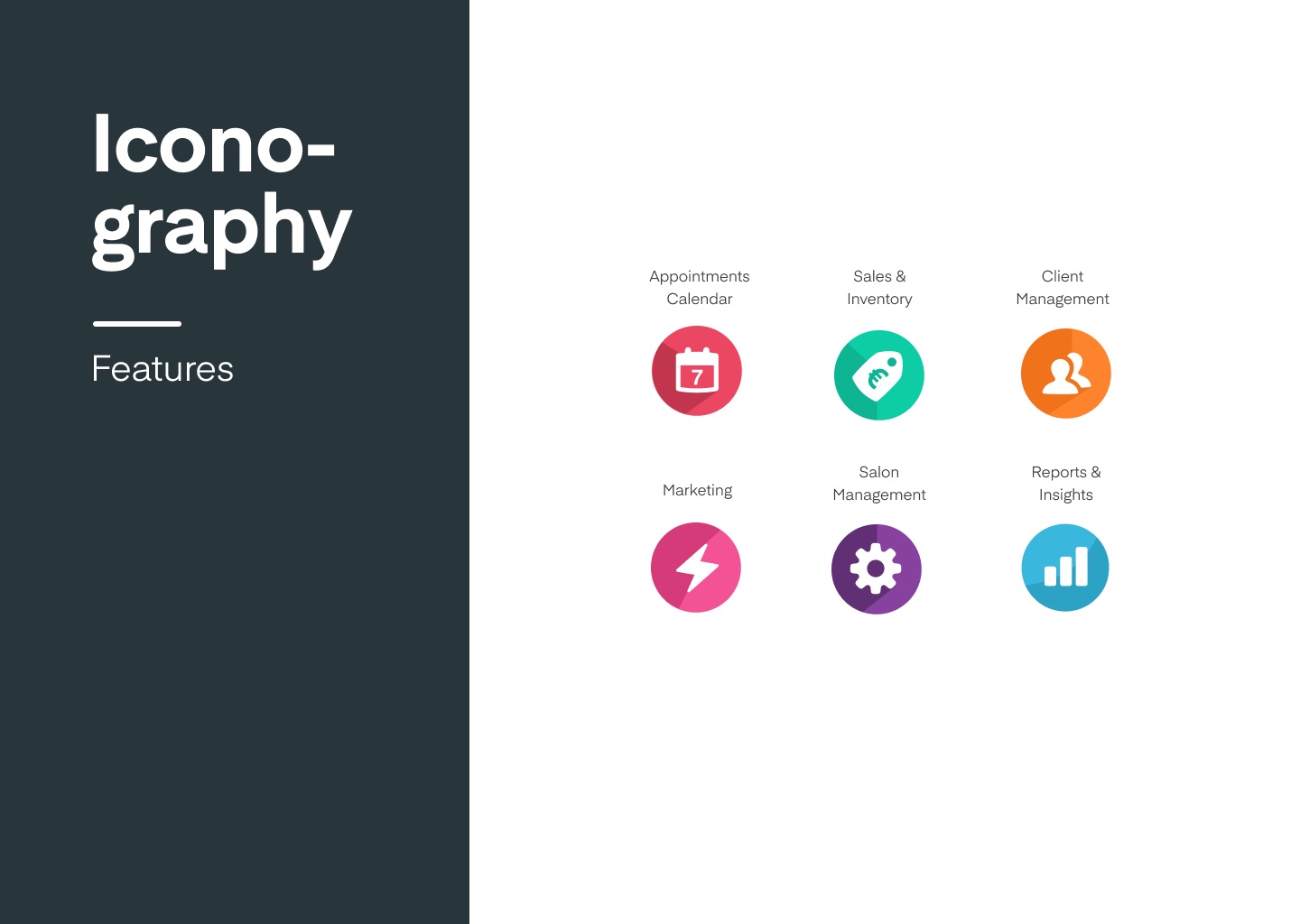
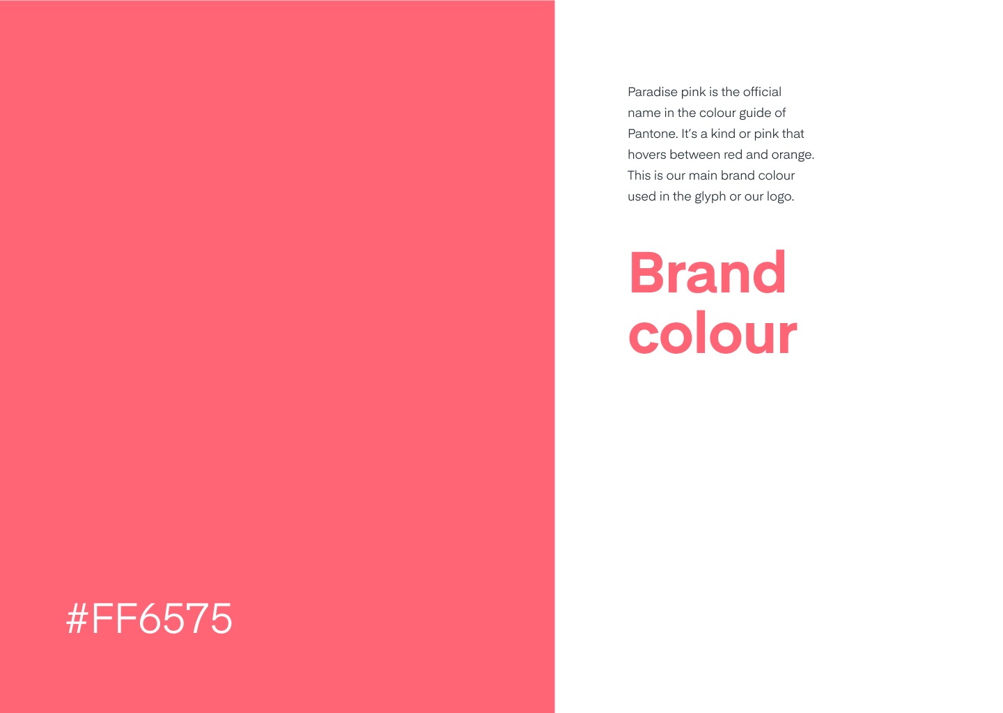
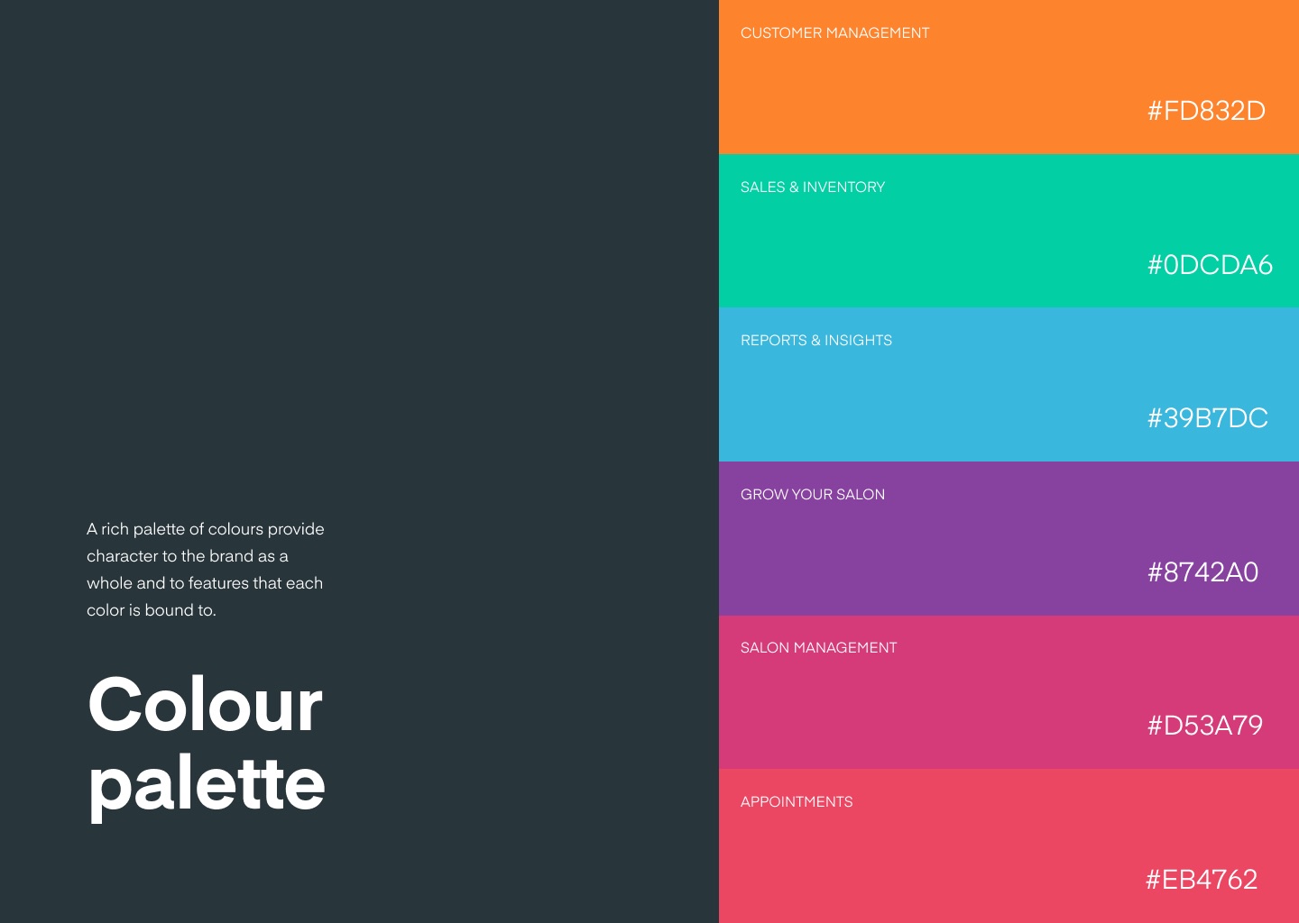
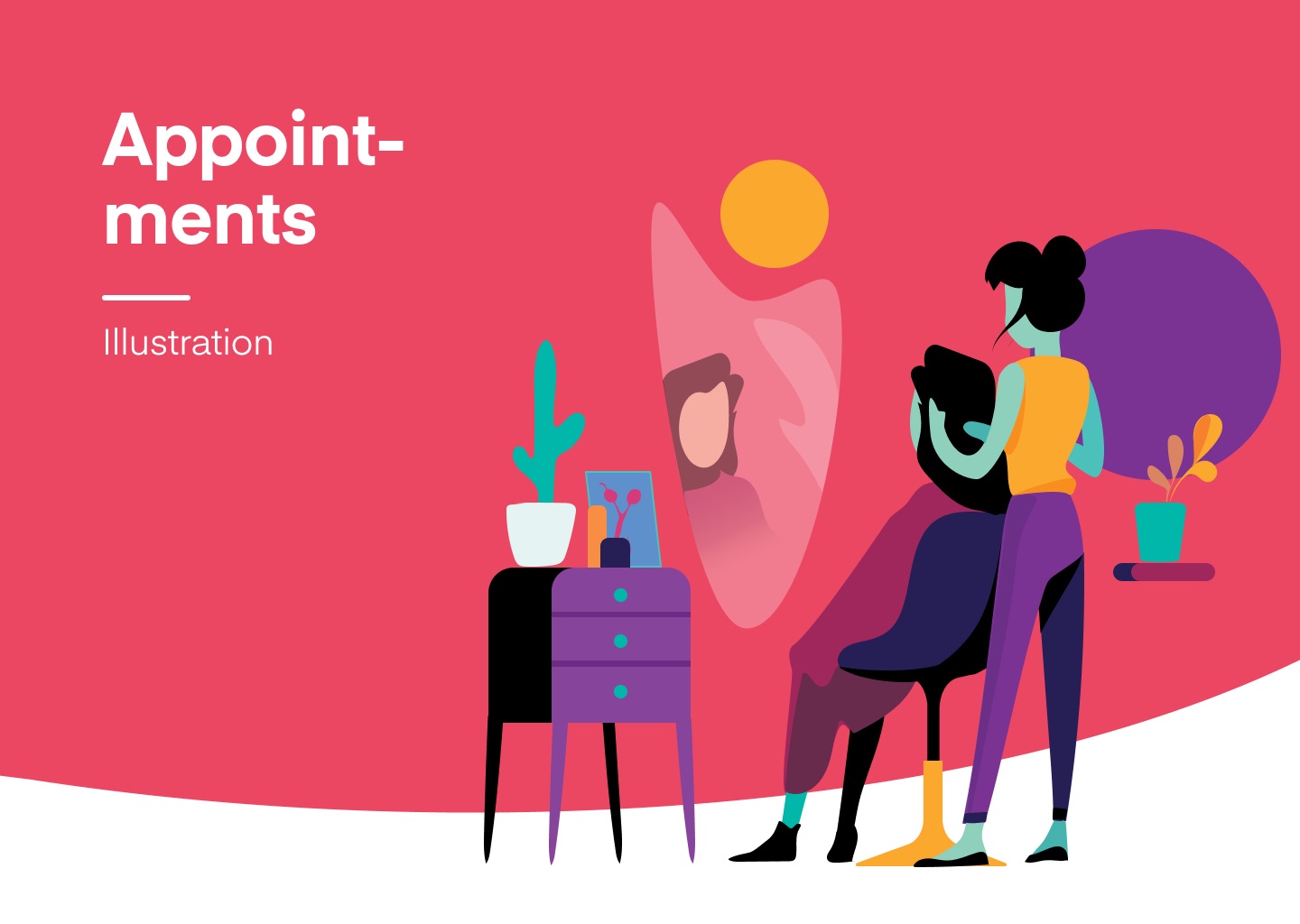
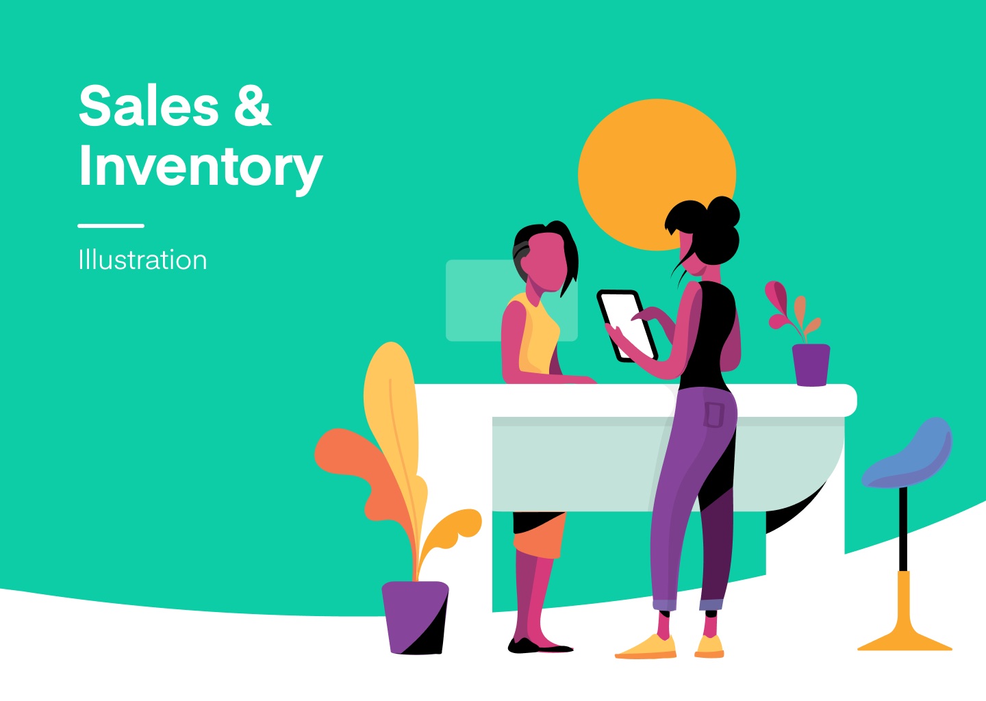
Paradise pink, #FF6575, sits between red and orange and became the one colour for the glyph and the logo. Around it I built a palette in which every part of the product owns a colour: appointments, sales and inventory, client management, marketing, reports. The same colour then marks that feature’s icon, illustration and section on the website.
Blobs, photos and type
Loose blob shapes in the palette colours give the brand its movement and openness. The same shapes crop salon photography, so real people and the graphic language belong together. A clear type hierarchy keeps the website readable between all that colour.
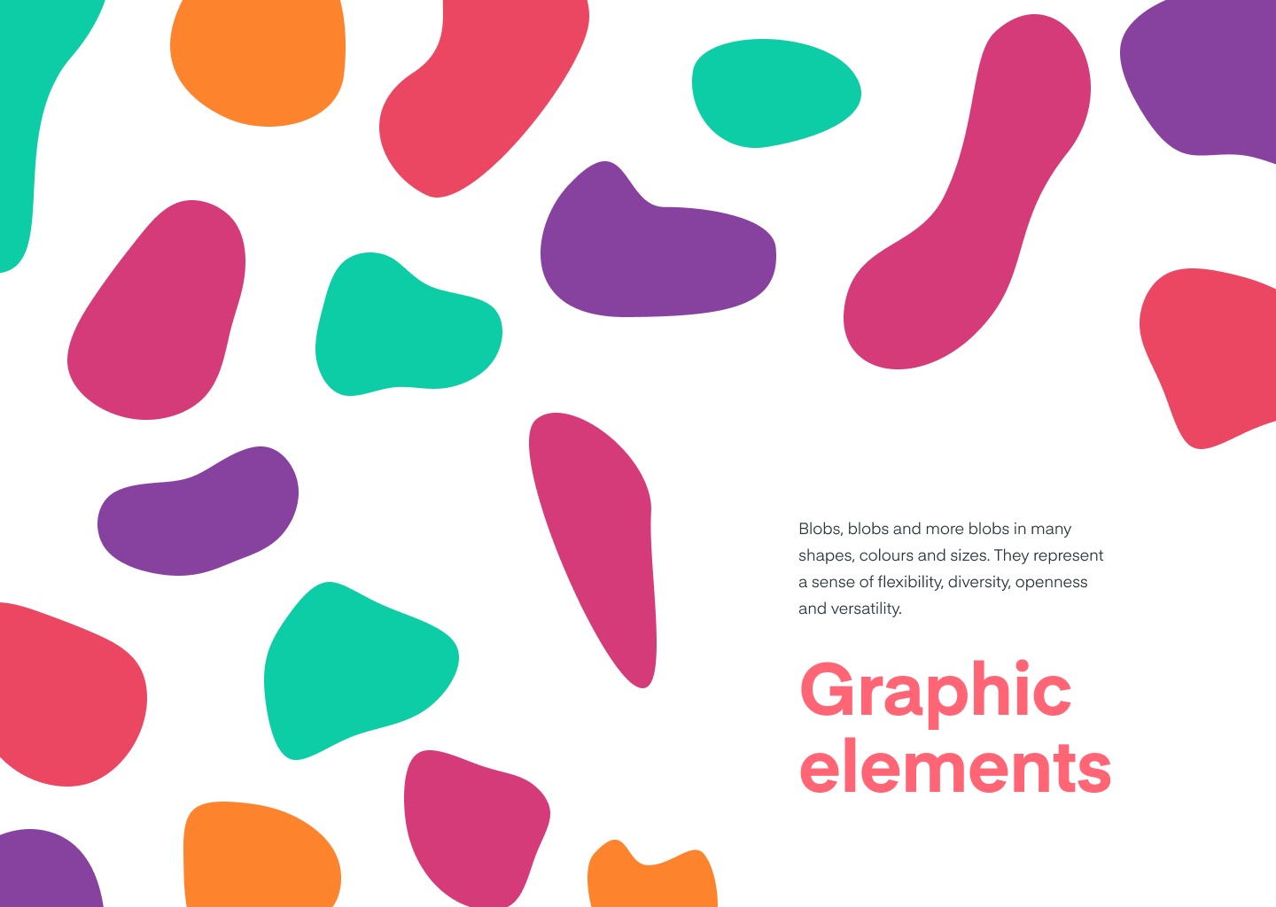
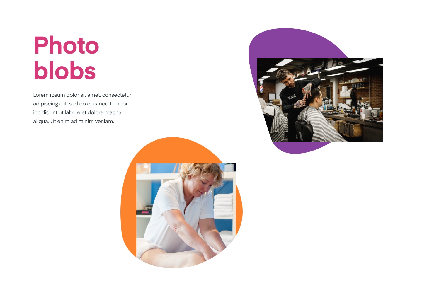
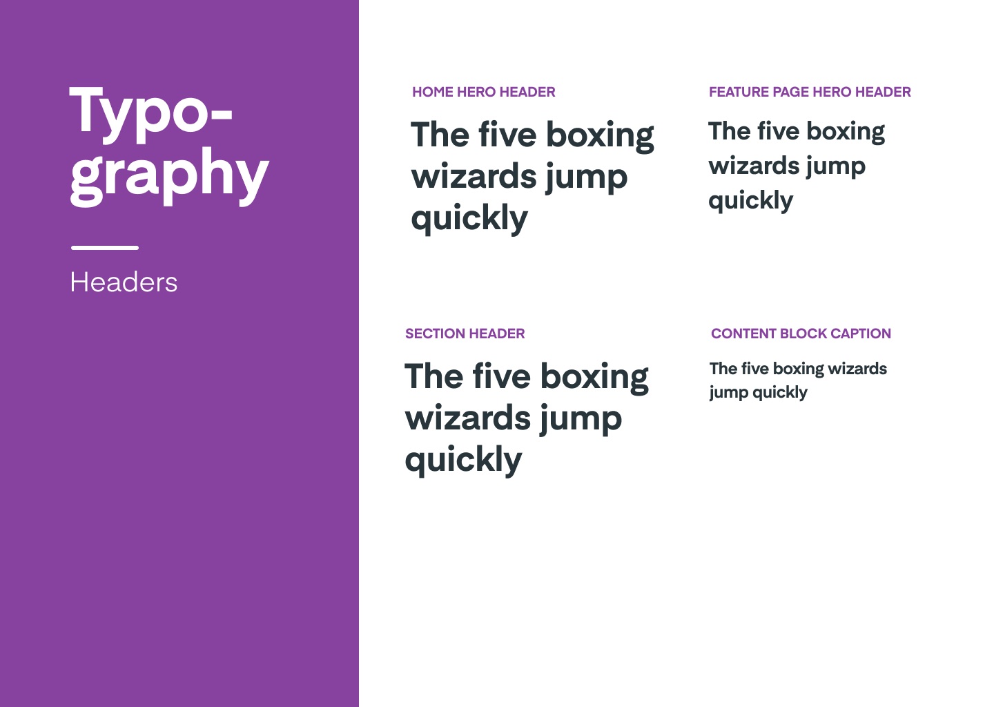
Illustration with an in-house illustrator
To make the brand feel genuine rather than stock, we hired an in-house illustrator, whom I supervised. Each product area got its own scene in its own colour, plus a set of feature icons in the same style. Together they carried the new homepage and the feature pages.

From guide to website
The identity went into a brand guide and straight into salonized.com: feature blocks in their product colours, coloured feature icons, and the illustrations at the top of each page. Stationery and the app followed the same rules.